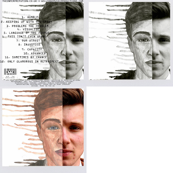
FRONT COVER

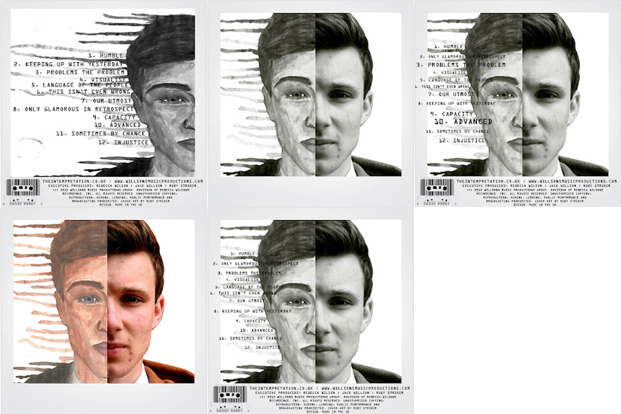
BACK COVER


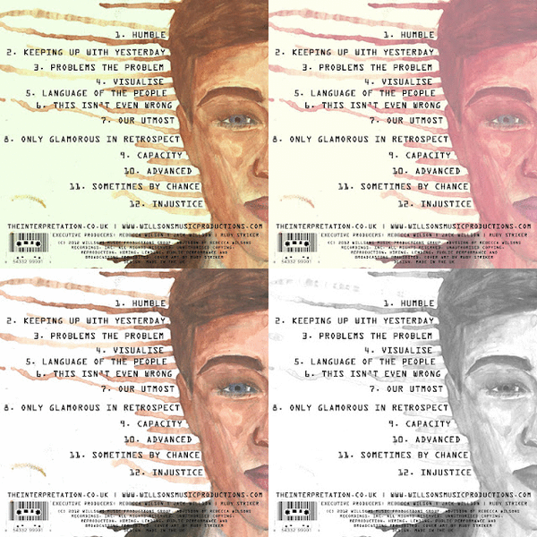
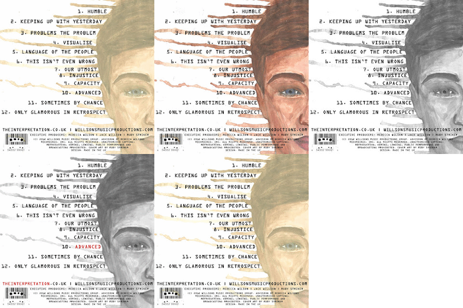 After altering the composition/placement of the water colour, making it fill up more of the back I edited the colours. Again I really like the black and white but this time I made it more contrasted and not as pale, but this time I incorporated some of the colour red into the text but only the text 'Advance' and 'The Interpretation' as these are the album name and the artists name. This would look good with this as a front cover. However the colours red and black don't really fit in that well with this genre as they are more of rock colours despite this I still think they go together well. I am really pleased with how well the font goes in between the drips of water colours.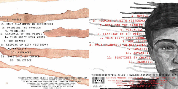

 |
| From initial research into indie album covers most if not all used capital lettering in a range of fonts on the front and back. I really like the old fashioned type writer font as it fits in with the genre well as it has a vintage feel to it, and is different. |


 |
| I edited the hue and saturation of this photo as well as adjusting the brightness to give it a vintage feel, and making the image soft and enhancing the green tones at the same time. I really like this photo especially more after it was edited as it is very interesting to look at, as well as making you wonder about where he is and what he is looking at. |
 |
| Again I edited the saturation of this photo making it a lot more striking as the blue and green tones really stand out. The colours of these come across as quite unrealistic and dreamlike in the sense that they are so bold. I like this image as similar to the one above it makes you question what he is looking at, where he is and why he's there, it would especially make people question any relevance to the location. |
 |
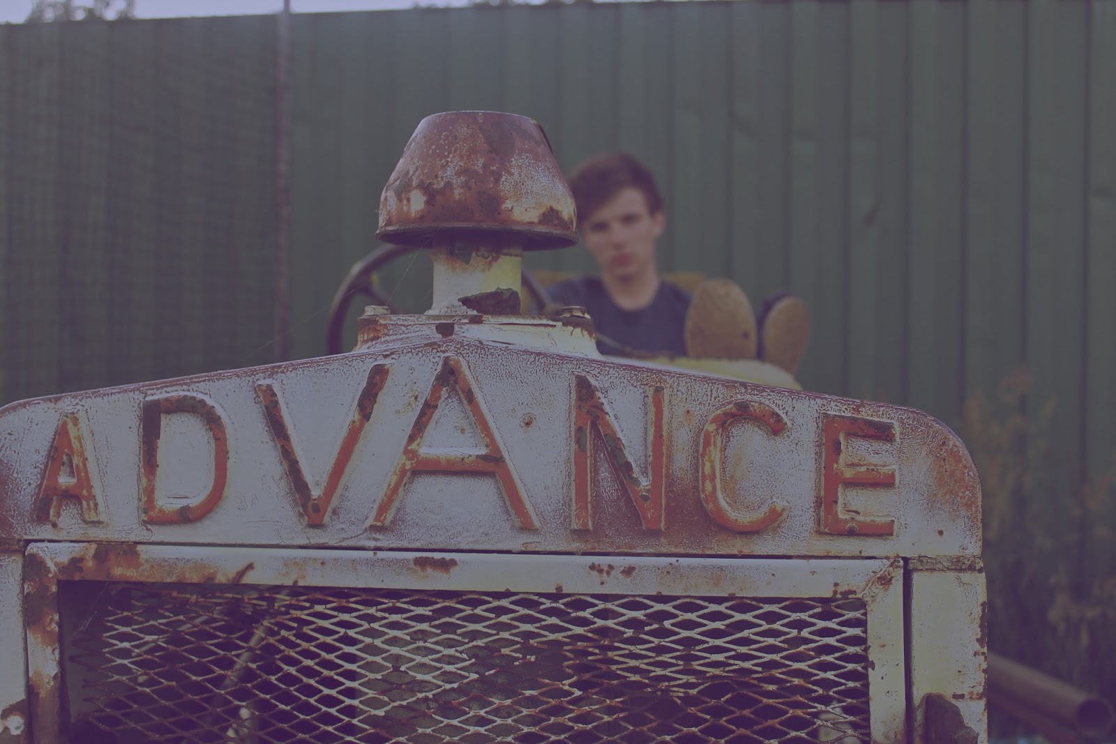
| I edited this so it had a very vintage/retro feel to it through the use of colours making the tones a lot softer and darker which makes the image a lot less clearer to see and by blurring the background it makes the person looking at it focus a lot more on the actually subject and composition. |
 |
| A lot of the indie albums I looked at had a black and white photo as the cover, I heavily edited the contrast in this photo making his facial expression unclear so he is still not making eye contact with the audience. I really like this photo in black and white as it is very effective, striking and bold. |
 |
| I edited this one to be a soft, black and white image, it would look interesting with a hint of colour though. |


 |
| I only edited the saturation slightly in this photo to really make the green striking, this photo would work well as both a front cover and even a back cover. |


 |
| I edited this by cropping and altering the composition in order to make the words 'advance' really apparent with the artist in the background so he is still part of the image but to make him the background subject I blurred the background leaving the main focus to the front of the image. |