1. In what ways does your media product use, develop or challenge forms and conventions of real media products?
Sticking to genre conventions in relation to music videos is primarily used to aid image of the artist and plays an important role in producing videos relating to certain personas and genres. Throughout the process of creating our video we took into account all the typical conventions of music videos while focusing on our chosen genre, indie. The research and planning showed us some initial conventions we could follow and soon it became noticeable that music videos from the indie genre used conventions from a range of genres from pop to rock to r'n'b. As we aimed to create a unique music video whilst still fitting into the genre we wanted to make sure our video was recognisable to the indie genre. Personally, I feel that we have succeeding in doing so as our final product has been exclusively created for our chosen song, this producing a music video which is distinctive.
Used
Mise en Scene - Costume
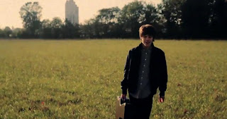
As a group we discussed the importance of the audience’s relation to the artist (post here) mainly the way in which indie artists come across as down to earth people, compared to other stars in the charts. Therefore an important factor we took into account was the use of costume within the mise en scene aspect of our video. We wanted our video and artist to be authentic, the clothes he wore played a huge part in his on screen image. I feel we dressed our artist as a typical male from our chosen genre would. We did so through the use of colours, styles and fashion trends. I think the use of clothes was very helpful in creating effective shots as if he was dressed in a suit the video would simply not have the same meaning or impact and the artist would be out of place. When it comes to indie music videos I instantly think of casual clothing and laid back attitudes. Initially I didn't think that indie artists put a lot of thought into their image but after research it became clear to me that they construct their individual image to fit into the one they want to portray and the music and image mirror each other. As you can see in the print screen from our video, our artist is dressed in green chinos and a cream knitted jumper with vans, the colours he was wearing were neutral and casual, fitting in with his surroundings. The print screen below it, is of the artist Jake Bugg from the video for his song Trouble Town where he is wearing monotone clothing with an old fashioned play on recent trends. Even though he is wearing a shirt he still comes across as very casual and laid back. On the whole sticking to this convention was a necessary choice because it is the one factor which can make our music video recognisable as indie.
Performance – Guitars
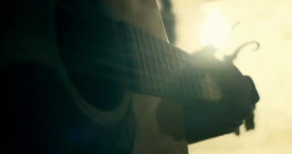
Without a doubt the most significant convention of the indie genre is the performance, (post here) a factor which is also evident in a lot of other genre conventions videos as well. In many music videos which I watched while researching I noticed a lot of references to instruments, mainly the use of guitars. As our artists song can be classed as acoustic indie we recognised the importance of including the guitar in our video, advert and digipack. I found that indie artists really emphasise the performance part of their image, singing and playing instruments, to prove themselves in a way that shows they can play giving them a chance to showcase their talents. We included performance shots throughout the whole video cutting to him playing his guitar using various shot angles and type while keeping him in one indoor location with his guitar for the majority of it and one outdoor location with his guitar at the end to signify the day from beginning to end. We used them as it gave the audience a connection with our artist as well as showing them his music ability, proving that he is the artist behind the song. As you can see from the print screen from our video we used different angled shots of the guitar from the neck downwards to the body or just the strings, each giving a different take on the same instrument making it more interesting to look at. The close ups on the guitar also make a point of proving that he is playing it. These shots are common within indie conventions, and the shot below our one is from a video of the band Mumford and Sons for the song Little Lion Man, it also emphases the use of guitar in the song and that a band member plays it.
We stayed within these two conventions throughout our video and the decisions to use both were made early on in the planning stages for it.
Developed
Vintage
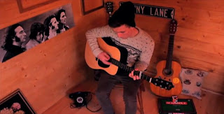
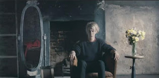
Another aspect of mise en scene which we incorporated through the use props, clothes, location and sets included in our video was the vintage/retro quality indie music videos have. This was something which was heavily present in some of the videos I researched into so it was an important convention for us to develop in ours. We developed this convention in the performance shots of him inside in the cabin only. In this set for our video we decorated a plain wood background with retro items such as a 1960’s guitar, references to The Beatles through posters and signs, old games and an old telephone. All had significance to either the songs meaning or lyrics or in representing the artist. For example the games show his playful, youthful side, his audience may not be familiar with the actual games as they are dated but they will be fond of the idea of the artist playing and carefree. Whereas the old telephone relates to the lyrics which he says ‘I’ll call you up’ and ‘pick up the phone’. And the Beatles memorabilia give an insight into some of his possible influences and a lot of his audience will be familiar with them as the band’s music is well known still. The evidence of vintage items developed throughout the stop motion of items appearing and disappearing around the artist but starts developing from when he turns the dial on the old radio. The print screen from our video shows the objects and location we used and the print screen below it shows a male artist in a run down location surrounded by old objects.
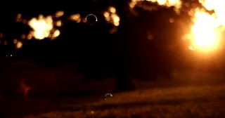
We used the development of lighting through the shots of artist performing his song in order to mirror going from waking up in the morning to the night time scene. The lighting develops as the song does and the natural morning light soon gets a little darker in the cabin set then a lot darker when the artist is performing outside in front of the fairy lights and under the moon. Lamplight is also a reference in the song so we have included close ups on lights turning on and off, the moons light and shots of close ups of fairy lights. The emphasis on the lighting was developed throughout as you can see in the print screen from our video we added a clip of a full moon that we managed to film in the evening, this put the morning scene into context and showed time passing. The other print screen is from Ben Howard's music video for his song Keep Your Head Up and shows the sunrise, the start of the day, the video then follows him throughout the day progressing with him and developing to early evening by the end. It also uses natural lighting throughout something which we did till the night scene where we needed lights to see our artist.
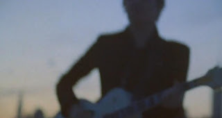
We developed the use of focus within our camera shots. We kept the memory/dream like shots lighter through the use of natural and soft light, slightly blurred and out of focus. We did this so the audience could see the difference between then and now. What was and what is no more. The use of out of focus shots was evident from the beginning with the blurred shot at the very beginning of him in bed signifying waking up, the blurry vision. They developed into close up shots of objects and out of focus shots of our artist playing in order to vary the shots. The print screen from our video shows a blurred shot of the artist playing in the cabin and the one below is from the video for One Night Only's song Say You Don't Want It which shows a blurred shot of a band member playing his guitar.
Challenged
Past and Present
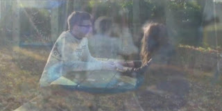
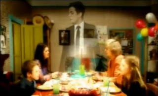
I feel that we challenged the use of one day throughout a video through the use of past and present shots within our video. We used shots of him playing his song which is about a girl, an ex girlfriend and cut between dreamlike shots which represent some of the memories he shared with her. We also went into the past by including shots of photos of the two of them together. As the song is clearly about a girl we felt the need to include some reference to her so we challenged this convention which is normally included in r’n’b and rap videos. It’s not common to include a girl as a girlfriend figure in indie music videos as for our artist the majority of his fans and audience are young girls who like to think he is exclusive to them. At first we were sure we wouldn't include any reference to a girl in our music video because of this but during the later planning stages we felt it would work well in our video and make it different to other videos from the indie genre. The contrasting shot location and types emphasised our use of past and present, and I feel that we challenged this convention successfully as although we stayed within the day to night convention through the use of lighting and location we also challenged it at the same time. The first print screen shows a part of the music video where we overlapped all the blurred, dream like footage as a memory montage highlighting that it all occurred in the past and is essentially a figure of his imagination where as the second print screen is from a different genre, rock, and from a video for The Killers song. It shows the artist as a ghost type figure playing with the idea of past, history to present and the future.
Editing – Stop Motion and Overlays
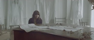
We challenged the use of editing techniques in our video as we wanted to steer away from creating a typical and conventional indie music video. We wanted to use a technique that would make our video stand out and differentiate itself from others I feel that we succeeding in doing so. Normally indie music videos don’t use fancy or even any editing techniques so we have challenged this convention in the context of our video. The only editing they tend to use is of altering the colour by changing the hues and tones to make the footage appear to be dated and filmed on an film camera. The print screen to the left taken from our music video shows some of our use of editing, we wanted to include a reference to the lyrics 'picture's still hung up' and decided this would be an effective way to do so. We changed the opacity and overlay two shots on top of each other cropping the sizes and making sure they fitted well. In all of the indie music videos we researched and watched for this project and before it as well I've not come across one what uses the same effect. We also used stop motion and a few stages throughout the video, also challenging the convention of simplicity in indie videos. This editing technique comes across as quite 'arty' so does fit in well with other conventions of the indie genre and I think that we challenged it successfully as it fitted into our video, making it unique to other indie videos and produced a different effect. The print screen below it is from a music video for Gabrielle Aplin's song The Power Of Love, the video is very simplistic and the only effect used is a colour adjuster apart from that the editing is subtle and simple. Heavily edited videos are usually from other genres, mainly from pop.
2. How effective is the combination of your main product and ancillary texts?
To answer this question we made a video as a group in which we commented on aspects of our music video, digipack and advert and the combination of the three. We made some general notes and recorded our audio answers to the question to then edit in final cut with photos and videos that link to what we were discussing.
3. What have you learnt from your audience feedback?
We asked an audience of ages between 16-19 to watch our video then fill in four questions that we decided would be useful for us to ask in order to find out some audience feedback. As we got a long list of answers I decided to make them into a word cloud to highlight the most common ones and some answers wee either very similar or the same. We annotated the video with the comments, colour coding each question and the good/bad points. We tried to do this clearly by putting relevant annotations at the relevant part of the video.
What do you think the story is in our video?
Would you say this is an 'authentic' indie music video?
What is effective about our video?
How would you improve it?
From the audience feedback we received I have learnt that if we were able to re do anything it would only be slight changes as most people really liked the video and thought that it was not only effective in many ways but was also an authentic indie video because of our use of costume, location and simplicity within the camera styles and subjects. We did ask them how they would improve it so if we were to take on their advice we would make sure the lip sync was 100% by making sure our acting artist really looked like he pronounced his words as if he was singing while filming. I also really like the suggestion in which someone said to start with a flashback of how it used to be, this would set the story for the rest of the video while leaving the audience questioning the purpose until the lyrics and other flashbacks appeared. Again I agree with the suggested improvement to take away some of the video effects as it was a convention we challenged I still feel that we did it well but I would add more flashback videos and shots of the artist performing in place of the photo ripping and scrunching stop motion. The use of stop motion was one of the most commented on effective part of our video though so if any changes were made it would still be included and if it wasn't as time consuming I think doing our whole video through the use of frames would of been really effective, or having the narrative flashbacks in stop motion and performance of the artist filmed normally. I was pleased to see that everyone understood the story/concept of our video, and everyone really got and liked the use of his memories alongside him and the contrasts of shots these were. This was something quite a few people agreed was effective and that these parts of video was realistic and easy to relate to. Another common comment was the effectiveness of our use of different camera shots and angles as well as our use of editing.
To get a little insight from non typical audience members perspective I played the video to my parents and asked them a few questions to see what they thought of our work. I asked them if they thought the video was convincing and both responded with yes.. as it looks professional and he fits into the style and all the locations and scenes intertwine well. I then asked them if watching the video would encourage them to buy the album or want to find out more about him and again both said yes and that they don't see why not. The answer to this is encouraging as they aren't normally a fan of this genre of music. I then asked if they thought it fitted into the indie genre and some of their answers included that it did as it's not too high tech and leads you into it, flows well and is easy on the eye. The only critisms they had was the use of lip sync in places and maybe would of preferred a different ending as they wasn't sure on it but other than these there was nothing else to criticise. They thought the stop motion of the objects appearing around the artist was well used and especially liked the moving image on the tree, the contrast of natural/man made tech on that part and lastly that lovely old hofner guitar fitted into the genre well. Another comment was that the image duration was very well considered and made you want to watch it again.
I found all the audience feedback we received to be really useful and it was a great insight into how our video is perceived by other people than us.
4. How did you use media technologies in the construction and research, planning and evaluation stages?
To answer this question I made this YouTube video to show the range of media technologies I used in the construction, research, planning and evaluation stages of my coursework. Technology was used heavily in most if not all stages of my work from the research into genres, music videos and albums and use of social networking sites to the editing of the video using final cut and filming our footage on canon cameras.I felt that all the technologies we had access to were all really beneficial and helpful. Web 2.0 online applications and sites whether it be social networking or online editors really helped me make the inlays and digipacks and the advert as effective as possible, from the research into the conventions and putting what I learnt from all of it into use. The cameras we had to use were also a great thing to have as one was a HD canon and the other a DSLR canon we were really able to get high quality shots that varied. All the media technologies I used worked to my advantage throughout this coursework.


