Showing posts with label Prelim. Show all posts

17/07/2012

DIGIPACK


FRONT COVER


BACK COVER


11/07/2012

PRELIMINARY TASK FINISHED VIDEO

Here is our finished preliminary task video, a remake of Ben Howard's Keep Your Head Up video.


Overall I am really pleased with the outcome of my groups work and I feel that the remake video we made is as close to the original as we could get considering our resources and time. We filmed each shot a few times or till we were completely confident and happy with what we had filmed and because of all our planning we executed it well. 

DIGIPACK BACK COVERS

I took a quick picture of Jack and proceeded to sketch half of his face to then paint it with water colours, I did a few different experiments with photocopied versions but this imaged fitted in best with the conventions of the genre as it was 'arty' yet not too extreme and abstract. We thought that we should create quite an arty album front/back cover to fit in with the indie genre. I'm pleased with the outcome of this initial piece as it is the basis to produce lots of different experiments and outcomes. As I had produced a lot of different yet similar experiments I created a moving image (gif) on Photoshop to present the variations.


picasion
The original one here I added text and chose to use this font as it was the most effective I found on Photoshop, looks like a typewriter/oldish type font and it's also bold and looks good in capital lettering as well as being easy to understand and read. After putting all the required text, links and a bar code on the cover I then used this as a basis to change make a few different colour variations to see which one was the most pleasing and effective. I really like the black and white version as the image is faded and the text is the darkest factor. I also like the one that appears just after the grey scale cover as it has a real retro/vintage feel to it which I achieved by editing the saturation levels.


picasionAfter altering the composition/placement of the water colour, making it fill up more of the back I edited the colours. Again I really like the black and white but this time I made it more contrasted and not as pale, but this time I incorporated some of the colour red into the text but only the text 'Advance' and 'The Interpretation' as these are the album name and the artists name. This would look good with this as a front cover. However the colours red and black don't really fit in that well with this genre as they are more of rock colours despite this I still think they go together well. I am really pleased with how well the font goes in between the drips of water colours.
picasion gif maker
These two are just quick variations. The back and white one was similar to the one above but this time I used a lot more red within it so it wasn't just black and white. The other was an accident but I really like the idea of it just not what we wanted to achieve with our back cover. 


picasion gif makerpicasion


10/07/2012

DIGIPACK SONGLIST

On the back of our digipack there needs to be a list of 12 songs, to make our one as realistic as possible the names need to be authentic and it in with the indie genre. After looking into a number of indie song names it became apparent that they were really quite random, some were quotes, some were only a word where as others were two or three. The following are the 12 song names that we have chosen to be on the back of our digipack..
1. HUMBLE
2. ONLY GLAMOROUS IN RETROSPECT
3. PROBLEMS THE PROBLEM
4. VISUALISE
5. LANGUAGE OF THE PEOPLE
6. THIS ISN'T EVEN WRONG
7. OUR UTMOST
8. KEEPING UP WITH YESTERDAY
9. CAPACITY
10. ADVANCED
11. SOMETIMES BY CHANCE
12. INJUSTICE

09/07/2012

DIGIPACK FONTS

From initial research into indie album covers most if not all used capital lettering  in a range of fonts on the front and back. I really like the old fashioned type writer font as it fits in with the genre well as it has a vintage feel to it, and is different. 


06/07/2012

DIGIPACK FRONT COVERS


This album cover includes a lot of conventions. The big, capital text reminded me of a newspaper heading like The Independent, and the album name looks similar to a sub heading, because of this I put an overlay of a music newspaper article over the top. The format also looks to be styled from a newspaper article with a title and subheading.  I chose to use black and white not only because it fits in with the newspaper theme it's also so the name of the band and album title really stands out and draws your attention into the image. I think this cover needs to be interpreted which is the bands name so it really fits in well. The use of overlays of a few images in these four potential cover edits also achieve this interpreted style we tried to achieve.


The black and white versions of the photo look a lot more effective then the colour versions in my opinion. In both the image still needs to be interpreted a lot as they are all confusing and cause the viewer to think twice about what actually is in the picture. I feel that they all fit in with the indie genre and conventions as they're arty and interesting and very different.                                                      
This is a great potential photo for both the front and back cover of an indie album.


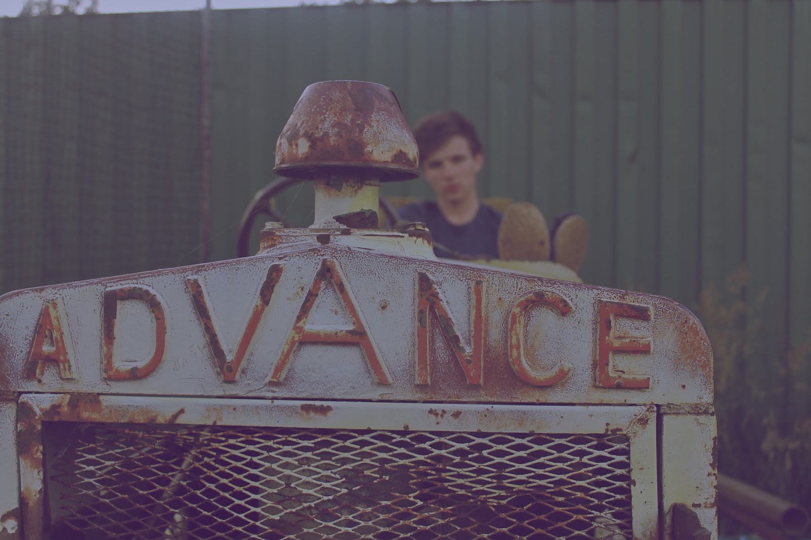
The idea of having the album title in the photo is really appealing. It makes the cover look a lot more authentic and also fits in with the indie genre as a few albums I researched into did similar things. The black and white image is bold itself, with the 'advance' the main subject of the photo I added a red film flare effect to draw some attention to the artist within the image.

30/06/2012

DIGIPACK PHOTOS

Here are just a selection of some of the photographs we took while filming on thursday, it was such a pretty and capturing location that we decided it would be an effective place to take some pictures for our indie album cover. These are just some quick edits of the photos I did on Aperture but we are going to sit and play around with getting a vintage style photo on Photoshop. Each one is editing differently, and it produced a range of outcomes which all fit in to the indie genre as they are very arty. I'm really pleased with the outcome of these shots so far, overall it was a successful day both digipack and music video wise. 

I edited the hue and saturation of this photo as well as adjusting the brightness to give it a vintage feel, and making the image soft and enhancing the green tones at the same time. I really like this photo especially more after it was edited as it is very interesting to look at, as well as making you wonder about where he is and what he is looking at.
Again I edited the saturation of this photo making it a lot more striking as the blue and green tones really stand out.  The colours of these come across as quite unrealistic and dreamlike in the sense that they are so bold. I like this image as similar to the one above it makes you question what he is looking at, where he is and why he's there, it would especially make people question any relevance to the location.
I edited this so it had a very vintage/retro feel to it through the use of colours making the  tones a lot softer and darker which makes the image a lot less clearer to see and by blurring the background it makes the person looking at it focus a lot more on the actually subject and composition. 
A lot of the indie albums I looked at had a black and white photo as the cover,  I heavily edited the contrast in this photo making his facial expression unclear so he is still not making eye contact with the audience. I really like this photo in black and white as it is very effective, striking and bold.
I edited this one to be a soft, black and white image, it would look interesting with a hint of colour though. 


I only edited the saturation slightly in this photo to really make the green striking, this photo would work well as both a front cover and even a back cover.


I edited this by cropping and altering the composition in order to make the words 'advance' really apparent with the artist in the background so he is still part of the image but to make him the background subject I blurred the background leaving the main focus to the front of the image. 

29/06/2012

FILMING UPDATE

Yesterday we filmed all the footage we needed for our version of Ben Howard's video for the song Keep Your Head Up. As we had a half day at school we were able to leave school after break at 11am and drove straight to our first location, where we took some photos and took into account exactly where we intended to come back and film each scene and in what order. We finished filming around 9pm as it started become too dark and we had enough shots by then as well. Rebecca and me took turns in recording and directing each shot and Jack played the role of Ben. The majority of our shots needed to be filmed with the sun set in the background so we had to take into account the time of day and where the sun was throughout the day to make sure we didn't miss it. In order to get the best shots we could we not only had a big piece of paper with the order of the shots and print screens of them on it we also decided it would be to our advantage if we were to download his version of the video onto a laptop so we would be able to watch it over and over in order to get our shots as close to the original as we could.

27/06/2012

STORYBOARD (SHOT TYPES & DURATIONS)


I printed out the shot list print screens and then cut them out and stuck them all down in order. Then we sat and wrote the shot types each one was and the duration of them all to give us a clear indication of what we need to have recorded when we go film. By sticking it to a piece of paper we will able to carry this around with us while filming.

DIGIPACK - BAND/ALBUM/SONG NAMES

We have decided that our indie band will be called 'The Interpretation'. This decision came after researching other indie bands names we realised that the names of all of the bands are actually pretty random and some are very weird. Many of the band names use The in their name, each one is unique but obviously inspired by something. After throwing a few words about to go after the, a few of the best ones were.. The Somethings, The Cohesive, The Interpretation, The Dialog.

Below are some potential album cover names, after researching a few albums I noticed that they were mainly statements or just a word.

- death was an exaggeration
- say you cannot do
- injustice
- our capacity for waiting
- you have for sure
- what isn't being said
- worthier
- with the utmost
- only glamorous in retrospect
- have trouble doing it
- quite a different kind
- much harder to detect
- problem is the problem
- by cynical about it
- humble
- earlier stages of development
- sometimes by chance
- keeping up with yesterday
- humble to the haughty
- visualise
- this isn't even wrong
- the mad are sane
- knowing what to overlook
- left on this earth
- what can't be done
- motivated by dynamic purposes
- duty to refrain yourself
- greatest threat to liberty
- language of the people
- database

MUSIC VIDEO REMAKE PLAN

Filming schedule.. We have decided that we are going to film on Thursday the 28th of June (tomorrow) and we're going to film in the sunset instead of the sunrise because of the practicability of the times. 


Locations.. We will be filming at two field/forest locations that are located around Finchingfield. 


Prop list.. The props needed for this remake are a bucket, bubbles, a sack, spade.

Equipment list.. We need a camera, hopefully an underwater camera and a tripod.

Actors.. There is one person in the first minute, and that's Ben Howard, who will be played by the only male member of our group, Jack Willson.
Costumes.. Jack will be wearing a purple t-shirt and dark jeans.


Weather report.. We have checked the weather report and the weather is meant to be sunny with some chances of rain and the sun set is at 9:30.

Shot list.. In order to get the shots we need, we have printed off print screens of the shots and put them in order, wrote down the timings of each and then put labels to what props are needed where and what type of shots they are.

DIGIPACK PLANNING

After looking at loads of different album covers for typical indie bands, it became clear that the covers usually involved artwork of some sort as they were all very arty covers. In the media lesson we had today we sat and discussed what we thought would make a good cover, we need to create one that incorporates the conventions of the genre as well. One idea that we all liked was to create a cover that had a half and half of Jacks face, one side the photo and the other a water colour piece that blends into the background. We also decided that the background needs to be a creamy colour and that the album needs a vintage type effect to make it as indie looking as possible. As well as this we liked the sound of crumpled paper as a background and use of mix media on top of a photo then scanned in, materials such as glitter, newspaper, ink and bleach. A combination of these would create a very individual cover. From looking at other album covers we noticed that a lot of them use capital letters with quite an arty font so we intend to use something similar to this. Also we thought about having the front of his face and the back of his back. Other ideas we like are to use pencil drawings, brown lettering, stamps/letter borders, words embedded within the actual photo,and the use of 'indie' outfits. To create a successful digipack we need to represent exactly who our artist is, their name, the album name, front cover, inlay, back cover, an effective font, list of songs in the album, bar codes and a few other aspects.

26/06/2012

KEEP YOUR HEAD UP SHOTS


I sat and print screened all the different shots that were included in the first minute of the video, this will be really helpful when planning and actually filming our version of the video. This will also be very effective when editing because it gies us a clear indication of the shot colours, tones and brightness.

PRELIMINARY TASK

In our chosen groups we got given the task to re-create a music video. We selected Ben Howard - Keep Your Head Up.


We have decided to re-create this music video up until 1:02 as we feel it is a nice finishing shot and what comes after it in the video wouldn't be that easy to re make. 

The genre of this music video is indie folk acoustic, and the outside theme throughout fits in well with this genre. The background of the opening shot has distinct bokeh camera effect, which carries on throughout the video. Bubbles in this shot as well, they're clear and the contrast between the two highlights them. They're also a theme through the video and could add a sense of childish nature to the video as bubbles are seen as something a child would play with. It has very natural lighting, with a sun rise opening up the video/day. The lyrics start when the person (Ben) appears into shot, which is a high angle of a man walking however despite the sunlight his actual figure is quite dark as e can't see his features just a shadow like outline. This keeps the audience wondering the purpose behind this and I think it's been done to show it's morning. Props so far have been minimal, we can see that he is carrying a shovel and haystack which could show that he is a hard worker and also ables the artist to be more relatable. In one of the shots where he is standing in a corn field, it looks like he his standing performing to a crowd in the sense that the crops mimic/mirror a sense of a crowd. The low blurred feet shot, shows that he's walking and also keeps it ambiguous. It looks like the clip of him walking has been edited and slowed down. The colour is edited as it's made more vivid, hue and saturation throughout which adds a dream like quality. Quick jump cuts are a music video convention which is included in the video to show that he is moving and to show different angles of him as well. The artist is portrayed as a normal guy throughout in casual clothing and a natural, down to earth appearance. He's very ordinary looking. The clear shot of nature, the tree, connects him to the place but also highlights where he is and the fact that he's outdoors and surrounded by nature. The blurred shots are somewhat dream like, especially the ones that are shots of nature with natural sun light coming through. With closes ups of parts of his body that are still blurred adds a sense of mystery in relation to what he's up to and what he's like. An obvious theme throughout is the bubbles, we follow them from the beginning and they guide the audience and build up to the end where it links up with the slide. Lots of feet shots, with bare feet could show that he is at home outdoors and is also a link to some of the lyrics 'skin' as he has rolled up jeans. Many different shot types have been used, even underwater shots and some over the shoulder shots as well as many shots from different angles. Parts of the video also play on some of the words that are in the lyrics. When it says 'walking back..' there's a mid shot of him carrying a bucket. We see him walking down a slope/hill when it says 'down this mountain' and there's a reference to 'skin' when there is a shot of his bare feet in water. Then when it says 'sun so hot..' the camera focus' on the sun. Also when it says 'embrace the darkness' (0:26) the shot is of a dark tree. Its a different video to a lot that are in the charts as it looks relatable and is filmed some where people have access too as well as looking interesting and fun.