Showing posts with label Analysis. Show all posts

31/10/2012

ANALYSIS OF INDIE DIGIPACKS 4

These three back covers are for indie artists. They all contain have a bar code and links to the record company, and artist website as well as copy right text and company logos.

Fonts: Only three different fonts used, the 'Kate Nash' logo font as it's the artists name and the font for the title of the album and song list, then the font used for all the important text at the bottom.
Colours: Black and pink colour scheme used.
Composition: Everything is centered apart from the bar code which is oddly placed in the top right corner.
Content: No pictures, just a plain colour and text.


Fonts: Again, three different fonts used in four different sizes. The artist name is in her recognised font and the largest out of them all, then the album name is below in capital lettering, this is probably the same as it is on the front cover. The song titles are bold and in lowercase. The last font is for the important legal information at the bottom.
Composition: Everything is centered.
Colours: Black and white, monochrome colour scheme.
Content: No pictures, just all the necessary content and even a logo.


Fonts: Handwritten song titles and then two other fonts for the artist website links and important information.
Colours: Red and white.
Composition: Song titles are to the left, the rest of the text is centered to the left. Then the bar code is in the top right corner.
Content: Just a plain background and text with scribbles.


Fonts: A hand written style font for the song titles and small text font for the important info.
Colours: White and sky/sea blue.
Composition: Everything is centered.
Content: Just the song names, artist name, bar code and information on legal parts behind the album.


Fonts: The name of the Artist is in their signature font with the rest of the text in the same font. Lungs, the title of the album is in capital letters.
Colours: Black and white.
Composition: Everything is centered on the page with the bar code placed at the bottom right.
Content: Diagram of lungs and text, the background also looks textured.


Fonts: Same font used on the front and have been made smaller or bigger to contrast them. Simple font for the rest of the text. Bold, capitalised artist name.
Colours: Sky blue, pinks, black and white.
Composition: All centered. Then the barcode is on the right side centered.
Content: Picture of the artist, song titles and relevant text.

11/10/2012

INDIE MAGAZINE ADVERTS

ANALYSIS OF INDIE DIGIPACKS 2

Artist: Penny Black
Album: Further Seems Forever
Colours: dull grey back ground highlights orange and yellows in the centre of the album cover. Disjunctive and incomplete image of the face implies an emotional or personal style of song. The image is also looks as if it has been painted on; artist themselves may have painted it which gives it more of a personal touch.
Font: Capitalised, times new roman font implies a statement from the artist. Also, as the font is an old style of orthography, it gives the impression that the artist has been around for a long time.
Editing: The saturation has been altered to emphasise a contrast between both the dull grey and the bright orange and yellow colours.
Symbolism: The female face which has been painted could either be the artist herself 'Penny Black' or some other person which the album could have been dedicated to. 
Connotations: Unfinished painting implies a piece of work half done, the album itself could be one half of another album possible to follow it from the artist.
Composition: Side on painting of the female, audience have an impersonal relationship with the artist. 

Lighting: bright colours imply a positive style of music which the artist has produced.


Artist: Stars
Album: The Five Ghosts
Colours: Black and white effect implies a old style to the band; either the band themselves have been around for a long time or it links to the idea of 'ghosts' which is the album name. However the red font colour for the bands name 'Stars' highlights the bands name despite it being positioned in the top left hand corner.
Font: the times new roman font echoes the ghostly old feel to the album cover as well as further implying that the band have been around for a long time.
Editing: The overlay of the of the 4 children gives the impression that they are indeed ghosts which correlates to the album name. However the faded overlay makes the audience search for the ghosts and shows an obvious and unsubtle hidden meaning.
Symbolism: symbolises being haunted and being watched. Gives a horror or chilling aspect to the band. It could also symbolise a tragedy taken place, either a real life one which the band know about or a fiction one.
Lighting: there is a heavy presence of low key lighting within the picture with accentuate the ghosts in the album cover; it also links to the Victorian imagery in the album cover. The low key lighting also gives a dull and washed out impression to the album cover.
Props: The bouquet of flowers which the young girl is holding shows her innocence and her youth. Making her seem young and pure which evokes sympathy for her as well as the other ghosts in the image.


Artist: Noah & The Whale
Album: Last Night On Earth
Colours: As the band are a vintage indie genre band; the washed out, dull colours are a typical vintage type of colours giving them a, somewhat, old fashioned personality.
Font: The capitalised font gives a tabloid/ broadsheet headline feel which implies that the band are wanted to be known and in the 'headlines', a subversion of the indie genre. The italics of the album name 'Last Night On Earth' implies an artistic style to the band; which is a convention of the indie genre. The then times new roman font under the bands name, implies that they have been around for a while despite the band themselves still being relatively young.
Editing: The overlay between the picture of the band and the night time city scene, implies that the band are urban based and originate from a urban place. The camera flare in the top right hand corner of the image is another typical feature of the indie genre, therefore further establishes them as a indie band.
Costumes: The band are all in smart attire, shirts and/ or a suit, implying a certain formality of the band as well as a possible target audience. However, the undone top buttons and rolled up sleeves shows that they are, somewhat, subverting from the smart and sophisticated style. Also, as the overlay image shows, it is a night scene and therefore the picture of the band is at the end of the day therefore they have become less smart.
Sight lines: Each member of the band is not looking directly at the camera which has taken the picture therefore implying a impersonal relationship with their audience; making them harder to engage as a band and establish a relationship with them.


Artist: Efterklang 
Album: Piramida
Colour: There is a monochrome colour scheme throughout the album cover, which despite being a dull looking colour it also implies simplicity; which the band want to possible want to be known for. Symbolism: The random, obscure and abstract background of the swirling and jagged images within the background of the circle allows for an open interpretation. The artistic style to the album cover is a common feature of the indie genre, therefore the band are clearly conforming to this genre.  The 3 dimensional triangle in the centre of the circle further emphasises the abstractness of the album cover and further allows for open interpretation.
Font: the capitalised band name is a common feature of the indie genre however as it isn't bold and enlarged it subverts the convention to some extent as well as further accentuating the simplicity style which the band seem to be going for. The lower case, slight italic font of the album name is off centre and barely draws any attention to it and therefore the audience focus is directed to the main subject of the album cover; the abstract drawing.


ANALYSIS OF INDIE DIGIPACKS 1

Artist: Noah and The Whale
Album: The First Days of Spring
Location: Outdoors, in the country side, they're stood in long grass on what appears to be a windy day. The location also relates to the title, as it says the first days of spring and the photo looks quite sunny and as if it was taken in spring.
Colours: The colours are actually quite neutral and typical of being in the countryside, as the photo has blues and greens as main colours in it.
Font: Use of bold font for the band name really brings the audiences focus onto the actual band and you have to look into the album title more as the font is smaller and lowercase.
Editing: The photo itself has been edited to give a vintage feel to it through the use of the saturation.
Symbolism: As the three in the background are looking up towards, this could symbolise worshiping.
Composition: The camera is slightly looking up to them and they're not in the center of the image as they are placed nearer the bottom, with only the top halves of their bodies showing.
Lighting: The use of lighting is very natural and fresh looking, as it is soft lighting.
Props: The only props used in the cover is a old camera which fits in to the convention of the indie genre as it is vintage and old looking.
Mise en Scene: They are dressed in simple, casual clothing, in shirts and denim
Position: The lead/front man is stood further forwards and is more in focus than the other three in the band which could mean he is the singer, although he isn't the center of attention as he is positioned to the right.


Artist: Two Door Cinema Club
Album: Tourist History
Subject: Floor tiles and a cat, the cat is actually quite an indie thing because of the representation behind it and in a lot of tumblr or even twitter bios from people that listen to the genre of music the link 'i love cats' tends to be present.
Location: Is somewhat unknown, you can only assume that it would be in a location that commonly has tiles so probably at home in a kitchen or bathroom focusing on the floor. This provokes some thought from the audience to where it actually has been taken and the meaning for it which is typical of indie artists as they like a good hidden meaning.
Colours: Despite having quite a few colours within it the overall concept is a minimal colour scheme as at first glance it could appear to be in black and white, only the markings on the cats fur and on the tiles and the cats eyes really look colourful.
Font: The font used is big, bold and white and of course it is in capital letters, a trait most, if not all indie artists tend to do on their album covers. The bands name is also written in their signature, logo looking font which is used on all of their future/past albums. The album name itself is hard to recognise but is still written in the same way as the bands name which makes it effective, just a lot smaller.
Editing: The top of the image is very dark and looks as if they have used a half vignette effect, it has definitely been contrasted a lot and the colour has been altered to give off a vintage vibe as the whole album itself looks very retro.
Symbolism: There isn't any obvious concepts or symbols within the album cover, the image doesn't obviously link with the album name or band.
Composition: All the text on the image is centered.
Lighting: The lighting is very dark in the image, however it has probably been editing to look like this.

Artist: The XX
Album: Coexist
Subject: The letter/symbol 'x' filled with a picture of what appears to be petrol/oil residue on the ground.
Colours: White background, rainbow colours used within the 'x'.
Font: Not a specific font, but still big and bold which is common of this genre.
Editing: An image has been cut into the shape of an 'x' this has made the outcome to be really unique.
Symbolism: The X simply is part of the bands name, but it could be taken to mean very different things for example uses of it in every day life is as a letter, the plus symbol and the times symbol.
Composition: Centered subject which makes it more pleasing to the eye.


Artist: Hedgehog
Album: Blue Day Dreaming
Subject: 3 people, the middle woman is looking up to the sky which could relate to the word day dreaming from the name of the album as she is not focused on a clear object it looks like she is day dreaming. The other two people in the background are both looking in different directions, one down and one straight forward although you can only tell from where their heads are as you can't see the eyes.
Colours: There is minimal colours with green and orange added onto the artwork as well as blue which relates back to the album title again, 'blue day dreaming' which is also in blue. Blue as a colour comes across as cold, and sad so maybe it means that the songs on there album have sad hidden meanings.
Fonts: Again, they have used big, bold and capital fonts for the bands name and used a mixture of upper and lower case for the album name.
Composition: The cover is split bottom half for the artwork image and upper half for the text. This also makes it look that the centered woman is looking up at the lyrics which could show that she is the lead, probably the singer. It's usual for the front/lead artist in the band to be centered and further forward than anyone or anything else on an album in the indie genre so they've followed certain conventions as they have also used artwork which creates a very unique and individual cover.
Props: Sunglasses, hide the eyes of what we can see of the faces of the two people in the background.

ANALYSIS OF DIGIPACKS 3

Artist: Ben Howard
Album: Every Kingdom
Colours: Blues and whites
Font: Large, simple, capitals. Artists name takes up a quarter of the album compared to the album name which is much smaller.
Editing: It looks as if it's been painted with watercolours which is significant as the image on the album is of a diver in the water.
Symbolism: By diving underwater it looks like Ben is travelling to another kingdom which relates to the album title 'Every Kingdom'.
Connotation: The image looks like he could be drowning or sinking or perhaps going to find something.
Composition: He is at the bottom of the image but in the centre. Even though he's not in the light he's still the focus.
Lighting: The top of the image is very light as it shows that he is diving down away from the sunlight.
Location: The location is underwater in the ocean.


26/06/2012

ANALYSIS OF AMY WINEHOUSE - BEST FRIEND

This is a picture of the digipack by Amy Winehouse called Best Friend which I analysed.


24/06/2012

ANALYSIS OF SEAN PAUL - TEMPERATURE


In this video we see the artist, Sean Paul, sing with dancers going through the seasons using a thermoset to connect them all together. He dances closely to female dancers throughout who are dressed accordingly to each season. The first season is centered around autumn with leaves blowing around and colours that are associated with this season. The temperature then drops on the thermoset until it freezers as it gets colder he's then in the snow all dressed in white. The third set is in the rain, with umbrellas focusing on the symbols of spring. Lastly we see him at a tanning studio, this set centered around summer. The colours used in each season, symbolise each one, for example the use of white clothing and set link with winter because snow is white. The genre of this music video is R&B and dancehall, with conventions of this genre generally being the singer surrounded by girls. The song lyrics and the video connect because of temperatures in each season and the thermoset connecting each scene together and linking the video to the song title as well. The lyrics of this song fit well into the genre and the image he portrays as he talks about girls throughout the song saying things like 'I wanna be keepin' you warm I got the right temperature for shelter you from the storm Oh lord, gal I got the right tactics to turn you on, and girl I...'. The song lyrics suggest he is a ladies man or even a player, as he says 'When you roll with a player like me... with a bredda like me girl there is no other'. The video starts with a close up on a thermoset with the temperature level there. There lots of cuts between shots of him, girls dancing and a thermoset with a range of close ups and long shots. I think the woman is represented to be more of an accessory in this video, especially in relation to the lyrics as well. By wearing sunglasses throughout a sense of connection is lost between him and the audience as there is no eye contact and in some clips he is facing directly towards the woman. Personally I think this video and the song links together well, and I like how it flows through the seasons with all the mise en scene connecting well to each one. I also think it's effective how when he says 'shelter you from the storm' he's sheltering a woman from the rain under an umbrella.

23/06/2012

ANALYSIS OF LANA DEL REY - BORN TO DIE

Lana Del Rey - Born To Die (2012) CD Cd cover
Lana Del Rey - Born To Die (2012) CD Back cover

Lana Del Rey is an American singer song writer, this is her second studio album. Born to Die is essentially a pop album but has many characteristics from musical genres such as alternative hip hop, alternative pop, indie pop and sadcore. The font is bold, capital letters in white and light blue which makes it very eye catching and readable but not to vivid or harsh. The background is very natural and light and actually has limited colour tones of blues, grays and green. The whole cover has a vintage vibe to it, from her outfit to make up to the surroundings. She's wearing quite a cover up type shirt with the buttons done all the way up, which is different to other woman artists of her age as it's usual for them to not wear much. It's quite a masculine item of clothing yet she manages to still look very feminine  in it. Despite the shirt being slightly see through so that you can see her bra there is a hidden are of sex appeal and that is her lips. Red lipstick really draws your focus to her face but mainly her lips with the light  bouncing of her features really flattering her face. Besides the red lips her make up is very natural looking and glowing which relates to the natural, outdoors background she is in. Her hair also has a vintage feel to it, with curls and it behind her shoulders emphasising her chest area. She has big gold hoop earrings on which are normally correlated with chav style. The album name born to die isn't reflected in the surroundings of the photo or even the person. The colours are pleasing to the eye, and natural. Her eyes are looking slightly downwards into the camera which connects her to the audience.

21/06/2012

ANALYSIS OF DIGIPACKS


P!NK - Missundaztood
The background is of what appears to be a leather car seat or chair of some sort which the artist is laying on. She is wearing a normal top with a image on the front but still showing flesh. Her make up is punky, with dark eyes and bold lips. With pink short hair it matches her artist name, P!INK. The font used is similar to graffiti style, and she has spelt misunderstood differently which is a phonemes. She has also only got two words on the front cover as well. There is a distinctive colour theme of pink tones with black and grey. The artist is making eye contact, with the camera so therefore the audience which makes it more personal. You can see she has a tattoo and there is also graffiti on the seat she's on. Got minimal accessories on, just wristbands and bracelets. I would say the theme of the album cover is possibly teenage rebelling. The image she portrays from this is as if she feels no one gets her, a teenager that is misunderstood.

RIHANNA - TALK THAT TALK
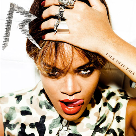
There is very little text in this album cover which brings peoples full focus to Rihanna, the artist. I think it's really clever how they have the album name along her wrist as if it was a tattoo. The white tiled background doesn't draw any focus away from the artist. The leopard print shirt could symbolise the fierce side of her. The way she is licking her lips makes her come across as cheeky or mischievous. Her hair is very messy and wispy which oozes sex appeal as it is bed hair. The camera angle is higher, so it looks like we are looking slightly down to her and she is looking up at us with her eyes making eye contact with ours. The album cover is very bold and striking and really catches your eye. Her make up is also bold, with bright red lipstick just highlights that the theme of the album could be sex appeal. The image she portrays is one of a fierce woman.

Plan B - The Defamation of Strickland Banks
Music for Plan B is all about the performance, the outfit, the band and the positioning to name a few factors and this album cover just portrays exactly this. I think this image symbolises the performer in him, as it's a stage image, the title. Even the name of the album is as if it's a film or movie. The use of the spotlight on Plan B is really striking, with his head down there is no eye contact or line. The text is very within the theme of the image which is really effective. The composition of the photo is great, he is centered, directly in the middle of the stage which draws your attention to him, yet as he is looking down he could come across as timid which is peculiar as he is in a performance environment. This could represent two sides to him as a person, one the performer and the other himself. Overall it is actually quite a dark image, but there is a balance within the framing of the shot. The lighting is very contrasted, with the spot light and low key lighting. I think the angle of the camera shot was from a low angle as we have to look slightly up at him, which may represent the power he has as the artist by dictating what he makes for us to hear possibly. The colour theme is of reds and blacks and whites. He portrays many different images just from this image depending on the way it's perceived however the most obvious one being a performer.

The Saturdays - On Your Radar
Each member looks very similar in this, as if they are clones, with the same make up, lipstick colour, same amount of skin showing and very similar hair styles. There is five woman on the cover, all in the band. The connotation within this album is that they are all the same or very similar people, maybe thoughts on conformity and even barbies or clones. The font used is very thin yet bold, and the colour scheme is fairly simple, with grey and white tones along with a hint of pink. After studying the image I don't feel the photo relates to the album title however maybe there is a deep hidden meaning. They are all staring right into the camera, each with different eye lines but all looking towards us.


Justin Bieber - Believe
The use of the black and white photo of the artist in this album really draws peoples attention towards the text. The way the light hits his face creating shadows makes his eyes really stand out to you even though he isn't making any eye contact you're still drawn to his eyes. There is a yellow colour theme. His image on this album is significally different to the others he looks a lot more grown up, sporting a fringe of his face hair style.

20/06/2012

ANALYSIS OF EMELI SANDE - NEXT TO ME


The video to 'Next To Me' is generally about the singer, Emeli Sande, singing and playing the piano in an empty warehouse as one of the locations alongside a male drummer. As the song progresses and the video goes on there are different locations and clips added of her. I think this music video would be considered to be from an indie/alternative genre because of the mise en scene in relation to the locations and outfits however the actual song itself sounds to be from the pop genre and her website states she is a Scottish soul and R&B artist. The target audience for this would be from ages 18-30, but teenagers would also listen to the song but i don't think that they would enjoy the video that much. I would say that the video does use some generic conventions, in relation to the singer performing and cutting between different shots of locations of her singing. The image that the artist portrays is quite a casual one, and definitely isn't one that oozes sex appeal as she is very covered up and looks some what tom boyish in her clothes but that defines her as it's her own personal style. This could draw in a more female audience, as males may choose to watch other music videos over this one because of this. The colours of her clothing aren't very striking but are boldly cut. This helps to get the audience to relate to her has she looks normal and not so in your face as most music videos are. She also performs with her instrument within the warehouse with a spotlight on her, this shows the connection she has with music and appeals to the audience as they enjoy the performance. As a character I feel that she is portrayed to be a likable person, who looks passionate about music, this is shown through close ups of her playing the piano and the facial expressions she pulls. She does make a lot of eye contact with the camera/audience which makes her performance a lot more personal, as if she was singing directly to and for them. Throughout the video there is a range of locations, around 4, and in each one she is wearing something different and in completely different surroundings and settings. There is also effective use of overlays in these, with use of bold colour it creates a really striking clip. With a fast cutting rate, and loads of different shots it keeps the audience interested. There even is an establishing shot at the beginning to set the initial scene. There is a blurred effect on some of the clips with some altering the focus areas, making different things in each shot the overall focus. The sound in the song has many musical instruments but in the video there is only 3 different instruments, these are the drums, piano and tambourine.