


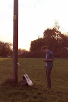
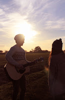
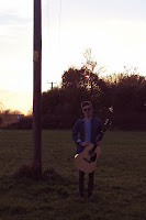
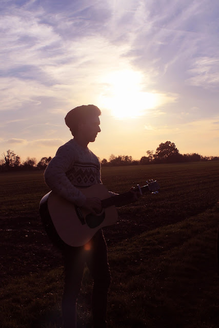
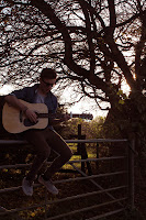
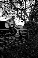
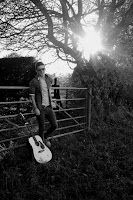
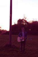
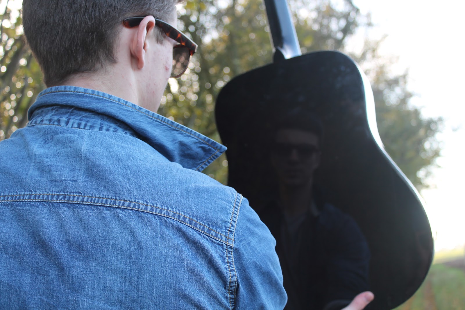

 As soon as this photo was taken there was something about it that I really liked. The fact that it the guitar body catches his reflection from an over the shoulder shot has really produced a different outcome and as it wasn't a planned shot or composition I was really pleased that we were able to capture it. The way the background has blurred to an almost daylight bokeh effect makes the image soft and draws all the attention to the artists figure. I even like the contrast between the sharpness of him compared to the reflection. Over all I just really like this picture! I then started to edit it on the editing software Adobe Photoshop, something I become to be familiar with over the years. We decided that our photos needed to have that vintage feel and I knew the way to achieve this was through experimenting with the colours, changing the tints, giving the photos hints of reds and decreasing the blues. I played around with the colour of all of the other images we took on this day which are in the other photo posts. The photos to the left show a quick before and after of a few minutes of editing. I like the composition of the shot but there is just something I felt that could be improved upon so I clicked on the editing tool and cropped away a lot of the content. I like this edit as you only see the reflection of him and the back of his collar rather than his head however it's not obvious that his reflection is in fact on his guitar and hasn't just been edited on. The use of the guitar within the shot for our digipack is important as it emphasises the relation to the artist.
 Therefore I decided to crop the picture into the right shape for a digipack. This made the appearance of the guitar clear and abled a part of the side of his face to be in the shot. I really like this composition and in my opinion it is a strong potential contender for the front or even the back cover of the album. The original photo could even be used across the front and back, by this I mean cutting the photo in half and having the relfection on the front as it is the front of him and the back of him on the back.


