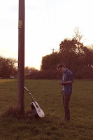
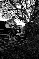
After carrying out some research into magazine adverts, it became clear that we needed ours to have a picture on it as the main focus and background. Some of the photos we took for the digipack would definitely fit into our criteria really well. Below are the examples of this. Personally I really like the black and white pictures as they are really bold and eye catching. They would all work well and paired with the right font I think there is potential for an aesthetically pleasing advert, one which would definitely be noticed and read while flicking through a magazine.
