17/07/2012

DIGIPACK


FRONT COVER


BACK COVER


11/07/2012

PRELIMINARY TASK FINISHED VIDEO

Here is our finished preliminary task video, a remake of Ben Howard's Keep Your Head Up video.


Overall I am really pleased with the outcome of my groups work and I feel that the remake video we made is as close to the original as we could get considering our resources and time. We filmed each shot a few times or till we were completely confident and happy with what we had filmed and because of all our planning we executed it well. 

DIGIPACK BACK COVERS

I took a quick picture of Jack and proceeded to sketch half of his face to then paint it with water colours, I did a few different experiments with photocopied versions but this imaged fitted in best with the conventions of the genre as it was 'arty' yet not too extreme and abstract. We thought that we should create quite an arty album front/back cover to fit in with the indie genre. I'm pleased with the outcome of this initial piece as it is the basis to produce lots of different experiments and outcomes. As I had produced a lot of different yet similar experiments I created a moving image (gif) on Photoshop to present the variations.


picasion
The original one here I added text and chose to use this font as it was the most effective I found on Photoshop, looks like a typewriter/oldish type font and it's also bold and looks good in capital lettering as well as being easy to understand and read. After putting all the required text, links and a bar code on the cover I then used this as a basis to change make a few different colour variations to see which one was the most pleasing and effective. I really like the black and white version as the image is faded and the text is the darkest factor. I also like the one that appears just after the grey scale cover as it has a real retro/vintage feel to it which I achieved by editing the saturation levels.


picasionAfter altering the composition/placement of the water colour, making it fill up more of the back I edited the colours. Again I really like the black and white but this time I made it more contrasted and not as pale, but this time I incorporated some of the colour red into the text but only the text 'Advance' and 'The Interpretation' as these are the album name and the artists name. This would look good with this as a front cover. However the colours red and black don't really fit in that well with this genre as they are more of rock colours despite this I still think they go together well. I am really pleased with how well the font goes in between the drips of water colours.
picasion gif maker
These two are just quick variations. The back and white one was similar to the one above but this time I used a lot more red within it so it wasn't just black and white. The other was an accident but I really like the idea of it just not what we wanted to achieve with our back cover. 


picasion gif makerpicasion


10/07/2012

DIGIPACK SONGLIST

On the back of our digipack there needs to be a list of 12 songs, to make our one as realistic as possible the names need to be authentic and it in with the indie genre. After looking into a number of indie song names it became apparent that they were really quite random, some were quotes, some were only a word where as others were two or three. The following are the 12 song names that we have chosen to be on the back of our digipack..
1. HUMBLE
2. ONLY GLAMOROUS IN RETROSPECT
3. PROBLEMS THE PROBLEM
4. VISUALISE
5. LANGUAGE OF THE PEOPLE
6. THIS ISN'T EVEN WRONG
7. OUR UTMOST
8. KEEPING UP WITH YESTERDAY
9. CAPACITY
10. ADVANCED
11. SOMETIMES BY CHANCE
12. INJUSTICE

09/07/2012

DIGIPACK FONTS

From initial research into indie album covers most if not all used capital lettering  in a range of fonts on the front and back. I really like the old fashioned type writer font as it fits in with the genre well as it has a vintage feel to it, and is different. 


06/07/2012

DIGIPACK FRONT COVERS


This album cover includes a lot of conventions. The big, capital text reminded me of a newspaper heading like The Independent, and the album name looks similar to a sub heading, because of this I put an overlay of a music newspaper article over the top. The format also looks to be styled from a newspaper article with a title and subheading.  I chose to use black and white not only because it fits in with the newspaper theme it's also so the name of the band and album title really stands out and draws your attention into the image. I think this cover needs to be interpreted which is the bands name so it really fits in well. The use of overlays of a few images in these four potential cover edits also achieve this interpreted style we tried to achieve.


The black and white versions of the photo look a lot more effective then the colour versions in my opinion. In both the image still needs to be interpreted a lot as they are all confusing and cause the viewer to think twice about what actually is in the picture. I feel that they all fit in with the indie genre and conventions as they're arty and interesting and very different.                                                      
This is a great potential photo for both the front and back cover of an indie album.


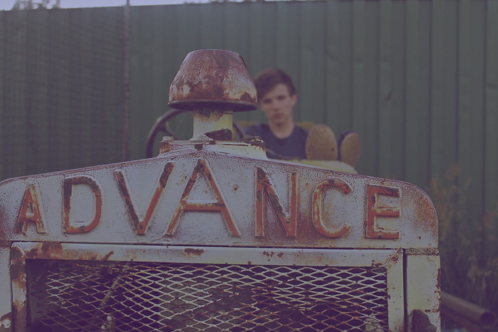
The idea of having the album title in the photo is really appealing. It makes the cover look a lot more authentic and also fits in with the indie genre as a few albums I researched into did similar things. The black and white image is bold itself, with the 'advance' the main subject of the photo I added a red film flare effect to draw some attention to the artist within the image.

30/06/2012

DIGIPACK PHOTOS

Here are just a selection of some of the photographs we took while filming on thursday, it was such a pretty and capturing location that we decided it would be an effective place to take some pictures for our indie album cover. These are just some quick edits of the photos I did on Aperture but we are going to sit and play around with getting a vintage style photo on Photoshop. Each one is editing differently, and it produced a range of outcomes which all fit in to the indie genre as they are very arty. I'm really pleased with the outcome of these shots so far, overall it was a successful day both digipack and music video wise. 

I edited the hue and saturation of this photo as well as adjusting the brightness to give it a vintage feel, and making the image soft and enhancing the green tones at the same time. I really like this photo especially more after it was edited as it is very interesting to look at, as well as making you wonder about where he is and what he is looking at.
Again I edited the saturation of this photo making it a lot more striking as the blue and green tones really stand out.  The colours of these come across as quite unrealistic and dreamlike in the sense that they are so bold. I like this image as similar to the one above it makes you question what he is looking at, where he is and why he's there, it would especially make people question any relevance to the location.
I edited this so it had a very vintage/retro feel to it through the use of colours making the  tones a lot softer and darker which makes the image a lot less clearer to see and by blurring the background it makes the person looking at it focus a lot more on the actually subject and composition. 
A lot of the indie albums I looked at had a black and white photo as the cover,  I heavily edited the contrast in this photo making his facial expression unclear so he is still not making eye contact with the audience. I really like this photo in black and white as it is very effective, striking and bold.
I edited this one to be a soft, black and white image, it would look interesting with a hint of colour though. 


I only edited the saturation slightly in this photo to really make the green striking, this photo would work well as both a front cover and even a back cover.


I edited this by cropping and altering the composition in order to make the words 'advance' really apparent with the artist in the background so he is still part of the image but to make him the background subject I blurred the background leaving the main focus to the front of the image. 

29/06/2012

FILMING UPDATE

Yesterday we filmed all the footage we needed for our version of Ben Howard's video for the song Keep Your Head Up. As we had a half day at school we were able to leave school after break at 11am and drove straight to our first location, where we took some photos and took into account exactly where we intended to come back and film each scene and in what order. We finished filming around 9pm as it started become too dark and we had enough shots by then as well. Rebecca and me took turns in recording and directing each shot and Jack played the role of Ben. The majority of our shots needed to be filmed with the sun set in the background so we had to take into account the time of day and where the sun was throughout the day to make sure we didn't miss it. In order to get the best shots we could we not only had a big piece of paper with the order of the shots and print screens of them on it we also decided it would be to our advantage if we were to download his version of the video onto a laptop so we would be able to watch it over and over in order to get our shots as close to the original as we could.

27/06/2012

STORYBOARD (SHOT TYPES & DURATIONS)


I printed out the shot list print screens and then cut them out and stuck them all down in order. Then we sat and wrote the shot types each one was and the duration of them all to give us a clear indication of what we need to have recorded when we go film. By sticking it to a piece of paper we will able to carry this around with us while filming.

DIGIPACK - BAND/ALBUM/SONG NAMES

We have decided that our indie band will be called 'The Interpretation'. This decision came after researching other indie bands names we realised that the names of all of the bands are actually pretty random and some are very weird. Many of the band names use The in their name, each one is unique but obviously inspired by something. After throwing a few words about to go after the, a few of the best ones were.. The Somethings, The Cohesive, The Interpretation, The Dialog.

Below are some potential album cover names, after researching a few albums I noticed that they were mainly statements or just a word.

- death was an exaggeration
- say you cannot do
- injustice
- our capacity for waiting
- you have for sure
- what isn't being said
- worthier
- with the utmost
- only glamorous in retrospect
- have trouble doing it
- quite a different kind
- much harder to detect
- problem is the problem
- by cynical about it
- humble
- earlier stages of development
- sometimes by chance
- keeping up with yesterday
- humble to the haughty
- visualise
- this isn't even wrong
- the mad are sane
- knowing what to overlook
- left on this earth
- what can't be done
- motivated by dynamic purposes
- duty to refrain yourself
- greatest threat to liberty
- language of the people
- database