28/11/2012
27/11/2012
26/11/2012
SOFTWARE
To date the software I have used most has been Blogger, it has acted has the outlet for all my research, planning and findings.
I have used Youtube as not only a research search engine but a place to upload videos of work.

In order to vary the appearance of my blog, I used the website Prezi.

Final Cut Express is a editing software program which I used last year throughout AS Media Studies.
 Adobe Photoshop was a very useful software to have access to when editing photos.

Aperture was another photo editing program that I had access to on my Mac.

Survery Monkey was a really great place to create a questionnaire to present to online audiences.
I have used Youtube as not only a research search engine but a place to upload videos of work.

In order to vary the appearance of my blog, I used the website Prezi.
Final Cut Express is a editing software program which I used last year throughout AS Media Studies.
Aperture was another photo editing program that I had access to on my Mac.

Survery Monkey was a really great place to create a questionnaire to present to online audiences.
A MAGAZINE ADVERT..
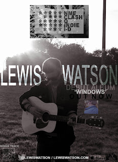
For our advert to look as authentic and as realistic as possible we must make sure we include some or all of the following factors; title of the album, image of the album, reviews, straplines, production company, website, theme, links to purchases places, star ratings, artist image, record company, CD logo and a colour scheme, bonus material, cross media platforms. These are the mandatory features of all magazine adverts.
Indie magazine adverts have a few common conventions, they normally have the appearance of being designed with a DIY approach and tend to be quite simple but still very creative. A lot, if not all adverts from the indie genre show that they are critically acclaimed in order to get recognition. I also think that they rely heavily on picture content as a photo of the artist with a vintage tint would really show that it is from this genre. Some have QR codes which allow audiences to get free content such as a download or bonus track. There is often a link to websites or twitter accounts so they can be easily connected with the artist.
There are two types of magazine advert concepts, they are either artist or album focused. As our artist isn't yet mainstream and is still very independently run and this is his first album as such so will be featured in the mainstream market our advert will be artist focused. If this album was very successful and he was to bring out another one our advert would be album based as the audience already knows what the artist does and doesn't need to be introduced to them for the first time again. Our advert combined with the other ancillary texts, the digipack, must link together well and be effective in relating to each other.
When choosing the right image, font and content for our magazine advert, it is important I include and take into account the content above.
22/11/2012
EDITING DAY
Today we were given the opportunity to spend a day editing together our music video. This gave us the chance to really look at what footage we have previously filmed and start to piece together a rough cut. After a morning of editing a decision was made to go out and film some more shots to give a bit of background story to the song, therefore we headed to the park to film some shots which we want to add in as his memories of his ex and as we liked the effect of stop motion we thought we'd add more context to the memory clips by using photos of him with the girl. Overall the day editing and doing some final filming was really successful as we now just need to add transitions and choose the best ending.
19/11/2012
EQUIPMENT
In order to get our filming done to a very good standard it's important we use the best equipment available to us.
This camera is one of the two we are using, while it is designed to take photos the footage it films is of a great quality and will also allow us to capture close ups and have bokeh backgrounds as well as in and out of focused shots.
 The second camera we used was provided by the media department at school and was a handheld canon camera. We thought it would be useful to use two cameras as two of us can film at the same time which will make the filming process less time consuming and a lot more beneficial. This camera can be easily attached to the tripod to make sure it captures a steady shot and it will film the necessary shots needed for our music video with ease.
 A tripod is a useful and necessary part of our equipment as it will allow us to film good, steady and unshaken shot. We will be able to film at a varying heights, as the legs can be adjusted accordingly.

To edit our music video and access our blog we have been using an apple iMac. This is a really beneficial piece of equipment for us to use and from previous work on it and having owning one at home I am completely at ease using it.
This camera is one of the two we are using, while it is designed to take photos the footage it films is of a great quality and will also allow us to capture close ups and have bokeh backgrounds as well as in and out of focused shots.
To edit our music video and access our blog we have been using an apple iMac. This is a really beneficial piece of equipment for us to use and from previous work on it and having owning one at home I am completely at ease using it.
14/11/2012
FILMING
12/11/2012
MAGAZINE ADVERTS
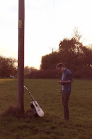
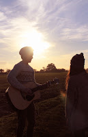
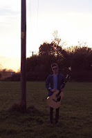
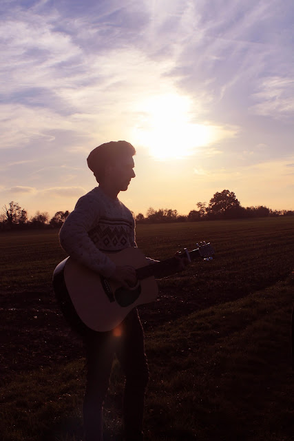
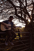
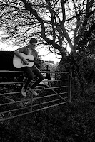
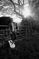
After carrying out some research into magazine adverts, it became clear that we needed ours to have a picture on it as the main focus and background. Some of the photos we took for the digipack would definitely fit into our criteria really well. Below are the examples of this. Personally I really like the black and white pictures as they are really bold and eye catching. They would all work well and paired with the right font I think there is potential for an aesthetically pleasing advert, one which would definitely be noticed and read while flicking through a magazine.
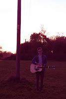


EDITING PHOTOS
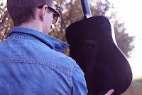
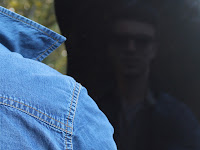 As soon as this photo was taken there was something about it that I really liked. The fact that it the guitar body catches his reflection from an over the shoulder shot has really produced a different outcome and as it wasn't a planned shot or composition I was really pleased that we were able to capture it. The way the background has blurred to an almost daylight bokeh effect makes the image soft and draws all the attention to the artists figure. I even like the contrast between the sharpness of him compared to the reflection. Over all I just really like this picture! I then started to edit it on the editing software Adobe Photoshop, something I become to be familiar with over the years. We decided that our photos needed to have that vintage feel and I knew the way to achieve this was through experimenting with the colours, changing the tints, giving the photos hints of reds and decreasing the blues. I played around with the colour of all of the other images we took on this day which are in the other photo posts. The photos to the left show a quick before and after of a few minutes of editing. I like the composition of the shot but there is just something I felt that could be improved upon so I clicked on the editing tool and cropped away a lot of the content. I like this edit as you only see the reflection of him and the back of his collar rather than his head however it's not obvious that his reflection is in fact on his guitar and hasn't just been edited on. The use of the guitar within the shot for our digipack is important as it emphasises the relation to the artist.
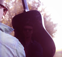 Therefore I decided to crop the picture into the right shape for a digipack. This made the appearance of the guitar clear and abled a part of the side of his face to be in the shot. I really like this composition and in my opinion it is a strong potential contender for the front or even the back cover of the album. The original photo could even be used across the front and back, by this I mean cutting the photo in half and having the relfection on the front as it is the front of him and the back of him on the back.
Subscribe to:
Comments (Atom)


