30/06/2012

DIGIPACK PHOTOS

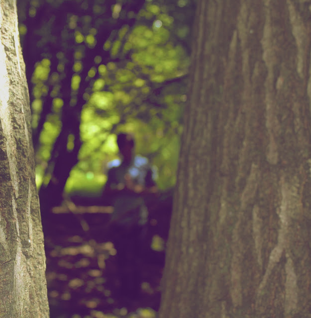
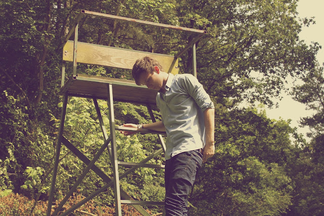
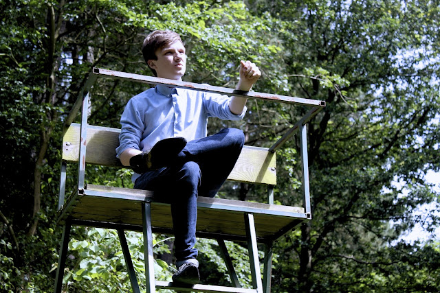
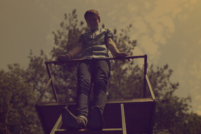
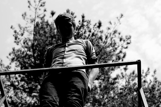
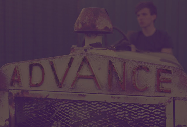
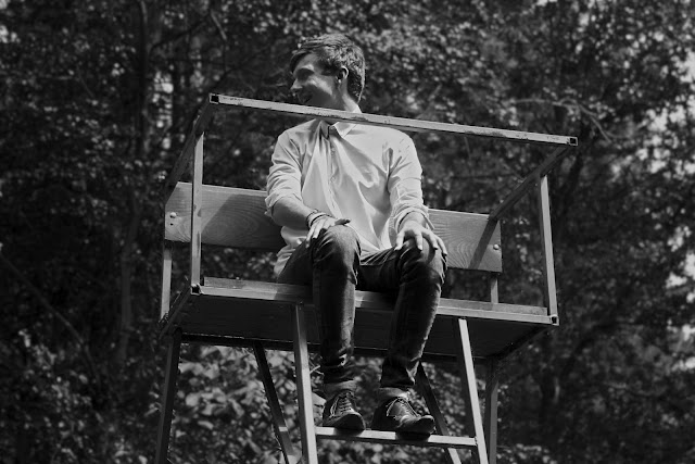
Here are just a selection of some of the photographs we took while filming on thursday, it was such a pretty and capturing location that we decided it would be an effective place to take some pictures for our indie album cover. These are just some quick edits of the photos I did on Aperture but we are going to sit and play around with getting a vintage style photo on Photoshop. Each one is editing differently, and it produced a range of outcomes which all fit in to the indie genre as they are very arty. I'm really pleased with the outcome of these shots so far, overall it was a successful day both digipack and music video wise. 

I edited the hue and saturation of this photo as well as adjusting the brightness to give it a vintage feel, and making the image soft and enhancing the green tones at the same time. I really like this photo especially more after it was edited as it is very interesting to look at, as well as making you wonder about where he is and what he is looking at.
Again I edited the saturation of this photo making it a lot more striking as the blue and green tones really stand out.  The colours of these come across as quite unrealistic and dreamlike in the sense that they are so bold. I like this image as similar to the one above it makes you question what he is looking at, where he is and why he's there, it would especially make people question any relevance to the location.
I edited this so it had a very vintage/retro feel to it through the use of colours making the  tones a lot softer and darker which makes the image a lot less clearer to see and by blurring the background it makes the person looking at it focus a lot more on the actually subject and composition. 
A lot of the indie albums I looked at had a black and white photo as the cover,  I heavily edited the contrast in this photo making his facial expression unclear so he is still not making eye contact with the audience. I really like this photo in black and white as it is very effective, striking and bold.
I edited this one to be a soft, black and white image, it would look interesting with a hint of colour though. 


I only edited the saturation slightly in this photo to really make the green striking, this photo would work well as both a front cover and even a back cover.


I edited this by cropping and altering the composition in order to make the words 'advance' really apparent with the artist in the background so he is still part of the image but to make him the background subject I blurred the background leaving the main focus to the front of the image. 

29/06/2012

FILMING UPDATE

Yesterday we filmed all the footage we needed for our version of Ben Howard's video for the song Keep Your Head Up. As we had a half day at school we were able to leave school after break at 11am and drove straight to our first location, where we took some photos and took into account exactly where we intended to come back and film each scene and in what order. We finished filming around 9pm as it started become too dark and we had enough shots by then as well. Rebecca and me took turns in recording and directing each shot and Jack played the role of Ben. The majority of our shots needed to be filmed with the sun set in the background so we had to take into account the time of day and where the sun was throughout the day to make sure we didn't miss it. In order to get the best shots we could we not only had a big piece of paper with the order of the shots and print screens of them on it we also decided it would be to our advantage if we were to download his version of the video onto a laptop so we would be able to watch it over and over in order to get our shots as close to the original as we could.

27/06/2012

STORYBOARD (SHOT TYPES & DURATIONS)


I printed out the shot list print screens and then cut them out and stuck them all down in order. Then we sat and wrote the shot types each one was and the duration of them all to give us a clear indication of what we need to have recorded when we go film. By sticking it to a piece of paper we will able to carry this around with us while filming.

DIGIPACK - BAND/ALBUM/SONG NAMES

We have decided that our indie band will be called 'The Interpretation'. This decision came after researching other indie bands names we realised that the names of all of the bands are actually pretty random and some are very weird. Many of the band names use The in their name, each one is unique but obviously inspired by something. After throwing a few words about to go after the, a few of the best ones were.. The Somethings, The Cohesive, The Interpretation, The Dialog.

Below are some potential album cover names, after researching a few albums I noticed that they were mainly statements or just a word.

- death was an exaggeration
- say you cannot do
- injustice
- our capacity for waiting
- you have for sure
- what isn't being said
- worthier
- with the utmost
- only glamorous in retrospect
- have trouble doing it
- quite a different kind
- much harder to detect
- problem is the problem
- by cynical about it
- humble
- earlier stages of development
- sometimes by chance
- keeping up with yesterday
- humble to the haughty
- visualise
- this isn't even wrong
- the mad are sane
- knowing what to overlook
- left on this earth
- what can't be done
- motivated by dynamic purposes
- duty to refrain yourself
- greatest threat to liberty
- language of the people
- database

MUSIC VIDEO REMAKE PLAN

Filming schedule.. We have decided that we are going to film on Thursday the 28th of June (tomorrow) and we're going to film in the sunset instead of the sunrise because of the practicability of the times. 


Locations.. We will be filming at two field/forest locations that are located around Finchingfield. 


Prop list.. The props needed for this remake are a bucket, bubbles, a sack, spade.

Equipment list.. We need a camera, hopefully an underwater camera and a tripod.

Actors.. There is one person in the first minute, and that's Ben Howard, who will be played by the only male member of our group, Jack Willson.
Costumes.. Jack will be wearing a purple t-shirt and dark jeans.


Weather report.. We have checked the weather report and the weather is meant to be sunny with some chances of rain and the sun set is at 9:30.

Shot list.. In order to get the shots we need, we have printed off print screens of the shots and put them in order, wrote down the timings of each and then put labels to what props are needed where and what type of shots they are.

DIGIPACK PLANNING

After looking at loads of different album covers for typical indie bands, it became clear that the covers usually involved artwork of some sort as they were all very arty covers. In the media lesson we had today we sat and discussed what we thought would make a good cover, we need to create one that incorporates the conventions of the genre as well. One idea that we all liked was to create a cover that had a half and half of Jacks face, one side the photo and the other a water colour piece that blends into the background. We also decided that the background needs to be a creamy colour and that the album needs a vintage type effect to make it as indie looking as possible. As well as this we liked the sound of crumpled paper as a background and use of mix media on top of a photo then scanned in, materials such as glitter, newspaper, ink and bleach. A combination of these would create a very individual cover. From looking at other album covers we noticed that a lot of them use capital letters with quite an arty font so we intend to use something similar to this. Also we thought about having the front of his face and the back of his back. Other ideas we like are to use pencil drawings, brown lettering, stamps/letter borders, words embedded within the actual photo,and the use of 'indie' outfits. To create a successful digipack we need to represent exactly who our artist is, their name, the album name, front cover, inlay, back cover, an effective font, list of songs in the album, bar codes and a few other aspects.

INDIE ALBUM COVERS

After researching into indie conventions I decided to find a range of album covers that fit into the genre of indie. They all have a distinct art influence to them, even the photos are heavily influenced by photography and are posed however it is a very diverse genre and the range of covers below show this. 
I really like this one, the simplicity of the colours and designs make it simple, effective and still very eye catching. The cream background creates a vintage feel and the border frames the image making it more of a finished piece. The title of the album of the cover fits in really well with the actual theme of it as well, this looks like it was purposely used. With a simple colour pallet they have achieved a really beautiful piece. The picture drawn is of a lion, which appears to be a common convention of this genre of albums. The font is black, bold and really stands out, it's also in capitals which really makes it more eye catching. They've also used three different fonts on the front cover, this is uncommon for an album cover as they usually have the same font throughout. 


This cover is basically a piece of art, it has a distinctive style to it with quite a basic colour pallet. Again like the one above it has a border. The subject of the cover makes you wonder the meaning behind it, the girl has a blank face, no emotions or facial features. It looks like a windy place, which appears to be quite random in the sense that there is a tree on water. You can barely notice the words on it, and you are only drawn to it because of their white background but even so the font is handwritten and very difficult to read. The background has a very vintage feel to it, and so does the rest of the colours within the piece. 


This is quite a weird album cover, it's very peculiar and similar to the one above the facial features aren't apparent so there is no sense of eye contact. The colours used are very simple and there is only two main colours used, black and pink. It includes a sketch piece of work.The font is bold but not completely readable as the tops of the letters are cut off however the capital letters still make it fit into a common convention of the indie genre as most of them feature capital lettering.
Again this album cover is simple, with a vintage feel background, bold capital lettering and an arty feel photo with a border to frame it. These are all factors which are apparent in the above indie albums and are conventions of the genre. The colour scheme is muted as well which adds to the effectiveness of this
This cover is very interesting and unique, it uses the conventions of artwork and muted colours from the indie genre and is very pleasing to the eye. Again like all of the above it is an arty cover. I really like how simple the idea is and how detailed the artwork contrasts that The font is very curly and old fashioned which is a common convention however it's not in capitals.

This is one of my favorite album covers so far even though it's very simple. The use of gold glitter is really effective and adds something else to what would of been just a photo, it also relates to the artists name as the glitter is gold and the name of the artist is santogold. The photo is of the artist herself making eye contact with the audience looking up to them and although these albums don't usually include the artist it still fits in as it has been heavily edited, and the photo is mirrored as if she is kneeling by water. Again very simple colours have been used, as it has a very muted colour scheme of just 3 initial colours white, gold and a purple/blue scale tint. It is very typical of an indie genre album as it has an arty cover as it includes photography, capital lettered text, different font.    

This photo is very cleverly composed as an album cover with the artist name and album title included in the photo itself, this makes you study the photo even deeper to really acknowledge what is happening in it. The use of black and white is really effective but makes the writing harder to notice, although as it's contrasted it really works well. I like how we see that she was the one who used chalk to write it, it looks as if she is making her mark on a wall, writing about a relationship, and about love. Her outfit and hair comes across to be very retro with a sixties feel which is common theme within the indie genre.


26/06/2012

KEEP YOUR HEAD UP SHOTS


I sat and print screened all the different shots that were included in the first minute of the video, this will be really helpful when planning and actually filming our version of the video. This will also be very effective when editing because it gies us a clear indication of the shot colours, tones and brightness.

PRELIMINARY TASK

In our chosen groups we got given the task to re-create a music video. We selected Ben Howard - Keep Your Head Up.


We have decided to re-create this music video up until 1:02 as we feel it is a nice finishing shot and what comes after it in the video wouldn't be that easy to re make. 

The genre of this music video is indie folk acoustic, and the outside theme throughout fits in well with this genre. The background of the opening shot has distinct bokeh camera effect, which carries on throughout the video. Bubbles in this shot as well, they're clear and the contrast between the two highlights them. They're also a theme through the video and could add a sense of childish nature to the video as bubbles are seen as something a child would play with. It has very natural lighting, with a sun rise opening up the video/day. The lyrics start when the person (Ben) appears into shot, which is a high angle of a man walking however despite the sunlight his actual figure is quite dark as e can't see his features just a shadow like outline. This keeps the audience wondering the purpose behind this and I think it's been done to show it's morning. Props so far have been minimal, we can see that he is carrying a shovel and haystack which could show that he is a hard worker and also ables the artist to be more relatable. In one of the shots where he is standing in a corn field, it looks like he his standing performing to a crowd in the sense that the crops mimic/mirror a sense of a crowd. The low blurred feet shot, shows that he's walking and also keeps it ambiguous. It looks like the clip of him walking has been edited and slowed down. The colour is edited as it's made more vivid, hue and saturation throughout which adds a dream like quality. Quick jump cuts are a music video convention which is included in the video to show that he is moving and to show different angles of him as well. The artist is portrayed as a normal guy throughout in casual clothing and a natural, down to earth appearance. He's very ordinary looking. The clear shot of nature, the tree, connects him to the place but also highlights where he is and the fact that he's outdoors and surrounded by nature. The blurred shots are somewhat dream like, especially the ones that are shots of nature with natural sun light coming through. With closes ups of parts of his body that are still blurred adds a sense of mystery in relation to what he's up to and what he's like. An obvious theme throughout is the bubbles, we follow them from the beginning and they guide the audience and build up to the end where it links up with the slide. Lots of feet shots, with bare feet could show that he is at home outdoors and is also a link to some of the lyrics 'skin' as he has rolled up jeans. Many different shot types have been used, even underwater shots and some over the shoulder shots as well as many shots from different angles. Parts of the video also play on some of the words that are in the lyrics. When it says 'walking back..' there's a mid shot of him carrying a bucket. We see him walking down a slope/hill when it says 'down this mountain' and there's a reference to 'skin' when there is a shot of his bare feet in water. Then when it says 'sun so hot..' the camera focus' on the sun. Also when it says 'embrace the darkness' (0:26) the shot is of a dark tree. Its a different video to a lot that are in the charts as it looks relatable and is filmed some where people have access too as well as looking interesting and fun. 

ANALYSIS OF AMY WINEHOUSE - BEST FRIEND

This is a picture of the digipack by Amy Winehouse called Best Friend which I analysed.


25/06/2012

STAR THEORY

Richard Dyer, is an English academic specialising in cinema. His star theory argues that we look up to stars and that a star is constructed like a band made up of elements like image, style and characteristics.

Stars as constructions... They are constructed, as artificial images through magazines, music, films and advertising. As a consumer we prefer it if the artist creates themselves instead of the record companies grooming them, this also helps them have a unique selling point which is good to have as it makes them different.

Industry and audiences... To make money stars are manufactured to make money from the target audiences for record labels. Record labels have to cater to different audiences as there are niche and whole markets of audience who desire something else.

Ideology and culture... Forms of media, such as online blogs and magazines are dedicated solely to celeb gossip, this is where fans can keep up to date and in the know about the lives of their favorite stars. Stars may also begin a fashion trend whether it be a hairstyle or clothing which is copied by the audience as well as this certain stars have cultural values and attitudes that audiences may share.

Character and personality... Stars are presented as real human beings, and they are representations of the contradictions that are in the music industry. We read about stars, see photos of them in magazines and as an audience we feel a little closer to them. Now we can also see their daily life in real time on social media platforms.

CONVENTIONS OF THE INDIE GENRE

Today we were put in groups in which we will be making our own digipack for an artist or band and we had to pick a genre out of a hat. Our groups chosen genre was Indie.


The Foals - Antidotes
Initially indie music was any music that was produced by unknown label artists, or unsigned bands however today when we think of indie music we refer to a music genre which is influenced heavily by folk, rock and electronic music. The genre originated in the US and UK in the 1980's as an alternative rock sound. It's very diverse, as it has many sub genres such as grunge and indie pop. During the 90's indie became the sound label for the bands and artists that were different, the ones that didn't fit the grunge, punk or britpop genre criteria. Then as a result of many alterations within the music industry, the 2000s saw a rise in indie rock acts enjoying commercial success which could also be seen as a result of the ever expanding Internet and it's importance.

The Dirty Projectors - Bitte Orca
The typical sound of this genre is melodic, with simple but well textured instruments. Usually includes an original yet simple guitar riff, with another guitar riff layered to complement them both with a bass doing the same. The drum beat is usually simple but fits the song well, then there is either a keyboard, violin or another instrument to highlight and bring out the underlying melody. The vocals are soft and well harmonized with powerfully emotional lyrics that spark emotion without being too depressing or whiny.

Vampire Weekend - Contra
Some examples of Indie artists and bands today are, Arctic Monkeys, Bon Iver, Bombay Bicycle Club, Bright Eyes, Florence and the Machine, The Fratellis, Ellie Goulding, The Pigeon Detectives, Noah and the Whale, Kate Nash, Mumford & Sons, MGMT, The Maccabees, Lykke Li, The Kooks, The Killers, Kaiser Chiefs, The Zutons, Damien Rice, The Script, The Smiths, Snow Patrol, The Temper Trap, Two Door Cinema Club, The Vaccines, Vampire Weekend and The Wombats.

James Blake
I have put photos of some examples of digipacks from indie artists in this post. Common factors of these are that they are artistic. They have muted colour schemes, and use edited photos, pieces of art or a mixture of the two and even a computerised art work. They're all interesting and don't tend to show the artists or band or any instruments unlike other genre conventions. They have quite arty fonts that are clear and really get your attention. They also remind me of vinyl artworks.


Lykke Li - I'm Good I'm Gone
The music videos of this genre has a huge variety of conventions. The videos are split between being performanced based and solely narrative and sometimes the artists don't even feature in the video itself although some of them do include performances either from the main vocalists or the entire band. In this genre narrative music videos are typically symbolic and quite arty, and make the audience guess as they usually don't spell out exactly what they lyrics mean.

These are all common conventions and characteristics of the indie genre.


24/06/2012

ANALYSIS OF SEAN PAUL - TEMPERATURE


In this video we see the artist, Sean Paul, sing with dancers going through the seasons using a thermoset to connect them all together. He dances closely to female dancers throughout who are dressed accordingly to each season. The first season is centered around autumn with leaves blowing around and colours that are associated with this season. The temperature then drops on the thermoset until it freezers as it gets colder he's then in the snow all dressed in white. The third set is in the rain, with umbrellas focusing on the symbols of spring. Lastly we see him at a tanning studio, this set centered around summer. The colours used in each season, symbolise each one, for example the use of white clothing and set link with winter because snow is white. The genre of this music video is R&B and dancehall, with conventions of this genre generally being the singer surrounded by girls. The song lyrics and the video connect because of temperatures in each season and the thermoset connecting each scene together and linking the video to the song title as well. The lyrics of this song fit well into the genre and the image he portrays as he talks about girls throughout the song saying things like 'I wanna be keepin' you warm I got the right temperature for shelter you from the storm Oh lord, gal I got the right tactics to turn you on, and girl I...'. The song lyrics suggest he is a ladies man or even a player, as he says 'When you roll with a player like me... with a bredda like me girl there is no other'. The video starts with a close up on a thermoset with the temperature level there. There lots of cuts between shots of him, girls dancing and a thermoset with a range of close ups and long shots. I think the woman is represented to be more of an accessory in this video, especially in relation to the lyrics as well. By wearing sunglasses throughout a sense of connection is lost between him and the audience as there is no eye contact and in some clips he is facing directly towards the woman. Personally I think this video and the song links together well, and I like how it flows through the seasons with all the mise en scene connecting well to each one. I also think it's effective how when he says 'shelter you from the storm' he's sheltering a woman from the rain under an umbrella.

23/06/2012

ANALYSIS OF LANA DEL REY - BORN TO DIE

Lana Del Rey - Born To Die (2012) CD Cd cover
Lana Del Rey - Born To Die (2012) CD Back cover

Lana Del Rey is an American singer song writer, this is her second studio album. Born to Die is essentially a pop album but has many characteristics from musical genres such as alternative hip hop, alternative pop, indie pop and sadcore. The font is bold, capital letters in white and light blue which makes it very eye catching and readable but not to vivid or harsh. The background is very natural and light and actually has limited colour tones of blues, grays and green. The whole cover has a vintage vibe to it, from her outfit to make up to the surroundings. She's wearing quite a cover up type shirt with the buttons done all the way up, which is different to other woman artists of her age as it's usual for them to not wear much. It's quite a masculine item of clothing yet she manages to still look very feminine  in it. Despite the shirt being slightly see through so that you can see her bra there is a hidden are of sex appeal and that is her lips. Red lipstick really draws your focus to her face but mainly her lips with the light  bouncing of her features really flattering her face. Besides the red lips her make up is very natural looking and glowing which relates to the natural, outdoors background she is in. Her hair also has a vintage feel to it, with curls and it behind her shoulders emphasising her chest area. She has big gold hoop earrings on which are normally correlated with chav style. The album name born to die isn't reflected in the surroundings of the photo or even the person. The colours are pleasing to the eye, and natural. Her eyes are looking slightly downwards into the camera which connects her to the audience.

22/06/2012

THE BEATLES - HELP

While I was looking for a video to analyse I wondered about where the concept of the music video originated from and what band created the first music video and stumbled across this. After reading it I decided that I would have a look at a few of the early examples and decided to put a bit about a very early significant music type video on my blog. The Beatles made their second feature film called Help! in 1964, and the title track sequence is 'arguably one of the prime archetypes of the modern performance-style music video', as it uses contrasting long shots, close ups and rhythmic cross-cutting, as well as unusual shots and camera angles. Therefore this 2 minute sequence could be the one of the first music videos which a lot of artists will have seen. It's filmed in black and white, with all four of the band members wearing dark clothes, this creates a lot of contrast within the video. There is a lot of shots which have specific focus places, with the main focus being whats closest whether it be a guitar or a person and in one shot with Lennon in the background it changed focus from him to Harrison's left hand and the neck of his guitar. Throughout a lot of different shots have been used, capturing all different aspects of the band play, from close ups to shots showing one person, or two or three or all four of them. 

21/06/2012

ANALYSIS OF DIGIPACKS


P!NK - Missundaztood
The background is of what appears to be a leather car seat or chair of some sort which the artist is laying on. She is wearing a normal top with a image on the front but still showing flesh. Her make up is punky, with dark eyes and bold lips. With pink short hair it matches her artist name, P!INK. The font used is similar to graffiti style, and she has spelt misunderstood differently which is a phonemes. She has also only got two words on the front cover as well. There is a distinctive colour theme of pink tones with black and grey. The artist is making eye contact, with the camera so therefore the audience which makes it more personal. You can see she has a tattoo and there is also graffiti on the seat she's on. Got minimal accessories on, just wristbands and bracelets. I would say the theme of the album cover is possibly teenage rebelling. The image she portrays from this is as if she feels no one gets her, a teenager that is misunderstood.

RIHANNA - TALK THAT TALK
There is very little text in this album cover which brings peoples full focus to Rihanna, the artist. I think it's really clever how they have the album name along her wrist as if it was a tattoo. The white tiled background doesn't draw any focus away from the artist. The leopard print shirt could symbolise the fierce side of her. The way she is licking her lips makes her come across as cheeky or mischievous. Her hair is very messy and wispy which oozes sex appeal as it is bed hair. The camera angle is higher, so it looks like we are looking slightly down to her and she is looking up at us with her eyes making eye contact with ours. The album cover is very bold and striking and really catches your eye. Her make up is also bold, with bright red lipstick just highlights that the theme of the album could be sex appeal. The image she portrays is one of a fierce woman.

Plan B - The Defamation of Strickland Banks
Music for Plan B is all about the performance, the outfit, the band and the positioning to name a few factors and this album cover just portrays exactly this. I think this image symbolises the performer in him, as it's a stage image, the title. Even the name of the album is as if it's a film or movie. The use of the spotlight on Plan B is really striking, with his head down there is no eye contact or line. The text is very within the theme of the image which is really effective. The composition of the photo is great, he is centered, directly in the middle of the stage which draws your attention to him, yet as he is looking down he could come across as timid which is peculiar as he is in a performance environment. This could represent two sides to him as a person, one the performer and the other himself. Overall it is actually quite a dark image, but there is a balance within the framing of the shot. The lighting is very contrasted, with the spot light and low key lighting. I think the angle of the camera shot was from a low angle as we have to look slightly up at him, which may represent the power he has as the artist by dictating what he makes for us to hear possibly. The colour theme is of reds and blacks and whites. He portrays many different images just from this image depending on the way it's perceived however the most obvious one being a performer.

The Saturdays - On Your Radar
Each member looks very similar in this, as if they are clones, with the same make up, lipstick colour, same amount of skin showing and very similar hair styles. There is five woman on the cover, all in the band. The connotation within this album is that they are all the same or very similar people, maybe thoughts on conformity and even barbies or clones. The font used is very thin yet bold, and the colour scheme is fairly simple, with grey and white tones along with a hint of pink. After studying the image I don't feel the photo relates to the album title however maybe there is a deep hidden meaning. They are all staring right into the camera, each with different eye lines but all looking towards us.


Justin Bieber - Believe
The use of the black and white photo of the artist in this album really draws peoples attention towards the text. The way the light hits his face creating shadows makes his eyes really stand out to you even though he isn't making any eye contact you're still drawn to his eyes. There is a yellow colour theme. His image on this album is significally different to the others he looks a lot more grown up, sporting a fringe of his face hair style.
20/06/2012

ANALYSIS OF EMELI SANDE - NEXT TO ME


The video to 'Next To Me' is generally about the singer, Emeli Sande, singing and playing the piano in an empty warehouse as one of the locations alongside a male drummer. As the song progresses and the video goes on there are different locations and clips added of her. I think this music video would be considered to be from an indie/alternative genre because of the mise en scene in relation to the locations and outfits however the actual song itself sounds to be from the pop genre and her website states she is a Scottish soul and R&B artist. The target audience for this would be from ages 18-30, but teenagers would also listen to the song but i don't think that they would enjoy the video that much. I would say that the video does use some generic conventions, in relation to the singer performing and cutting between different shots of locations of her singing. The image that the artist portrays is quite a casual one, and definitely isn't one that oozes sex appeal as she is very covered up and looks some what tom boyish in her clothes but that defines her as it's her own personal style. This could draw in a more female audience, as males may choose to watch other music videos over this one because of this. The colours of her clothing aren't very striking but are boldly cut. This helps to get the audience to relate to her has she looks normal and not so in your face as most music videos are. She also performs with her instrument within the warehouse with a spotlight on her, this shows the connection she has with music and appeals to the audience as they enjoy the performance. As a character I feel that she is portrayed to be a likable person, who looks passionate about music, this is shown through close ups of her playing the piano and the facial expressions she pulls. She does make a lot of eye contact with the camera/audience which makes her performance a lot more personal, as if she was singing directly to and for them. Throughout the video there is a range of locations, around 4, and in each one she is wearing something different and in completely different surroundings and settings. There is also effective use of overlays in these, with use of bold colour it creates a really striking clip. With a fast cutting rate, and loads of different shots it keeps the audience interested. There even is an establishing shot at the beginning to set the initial scene. There is a blurred effect on some of the clips with some altering the focus areas, making different things in each shot the overall focus. The sound in the song has many musical instruments but in the video there is only 3 different instruments, these are the drums, piano and tambourine. 

19/06/2012

AN ARTISTS IMAGE..

Artists can be shown through a text, this includes the way they are represented whether it be through their appearance, album covers, photo shoots, magazine covers, on adverts, music videos and general appearances. Over time they seem to build up their 'image', which makes them unique as an artist. People then associate the genre of music with that artists appearance and style.  It can also be created or shown through the actual song, the lyrics, the names and the stage image. An artist isn't a text however in their complete media product these three factors, image, language of the songs and sound all combine to form texts. How all this appears in the videos, posters, adverts and appearances is just as important as the music.

HELLO!

This is my A2 media coursework blog!